About LampShopOnline
LampShopOnline is an e-commerce retailer specializing in lighting solutions for both B2B and B2C customers. The store offers a vast product range, from household bulbs to industrial lighting.
The Challenge
The website had grown without a clear UX strategy, resulting in:
- Unclear categorisation: Product categories were mixed, and technical product names confused users.
- Outdated Design: The visual design lacked consistency and modern standards, reducing trust and making the interface harder to scan
- Lack of a guided shopping experience Customers had to rely on technical specifications instead of being able to shop by usage (e.g., garden or office lighting).
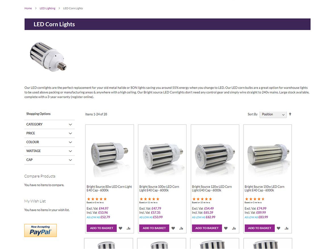
- Cognitive overload: Over 50 product variations were displayed at once, making it hard to scan.
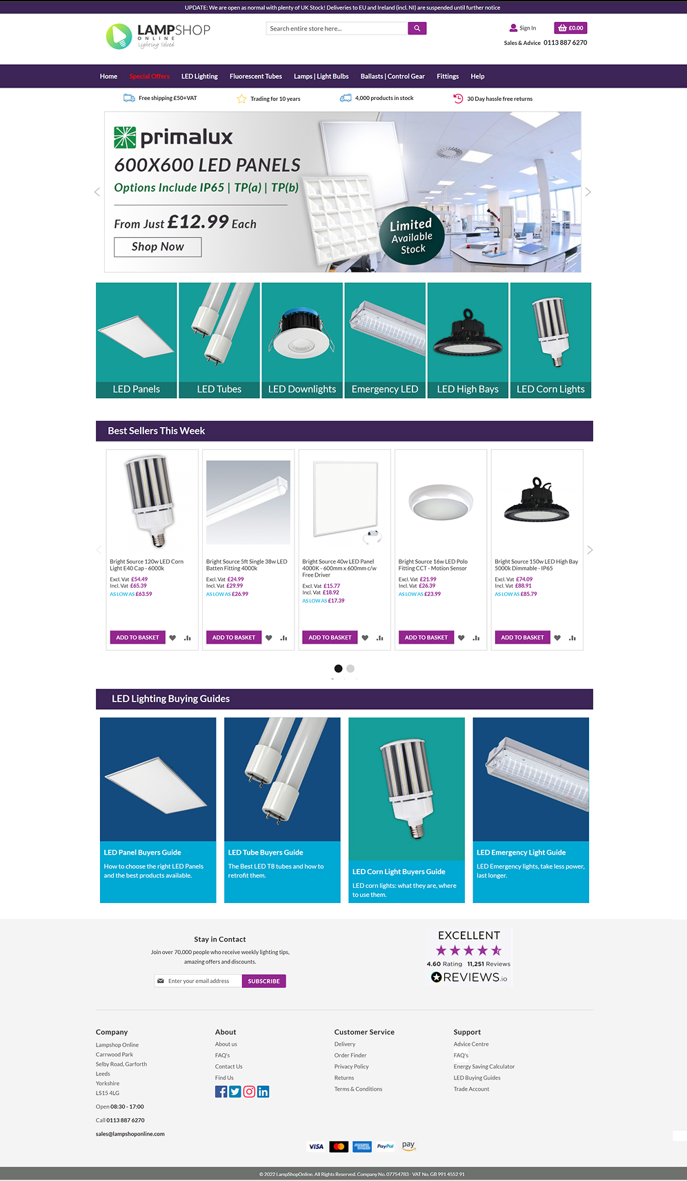
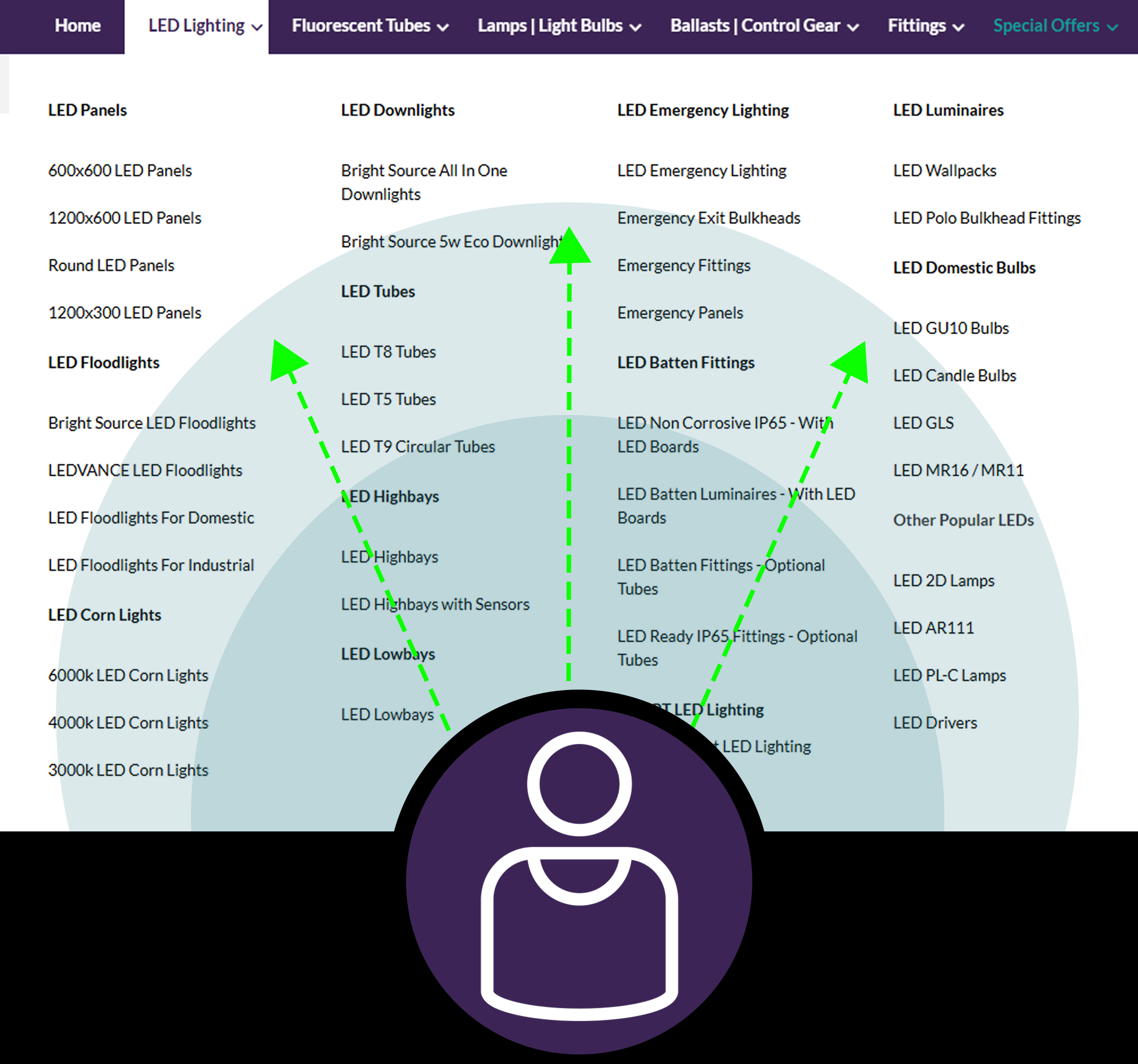
Main Navigation before the re-design.
My Role in This Project
I led the UX/UI redesign and rebrand of LampShopOnline, focusing on improving product discovery, reducing friction across key customer journeys, and creating a more modern e-commerce experience.
My role covered usability testing, information architecture, wireframing, prototyping, visual design, logo redesign, and collaboration with developers to bring the new experience into production.
I also created a more consistent visual system, including updated colours, typography, layout structure, hierarchy, and reusable UI components.
Conduce Research
Present outcome to stakeholders
Design the solution
Victory
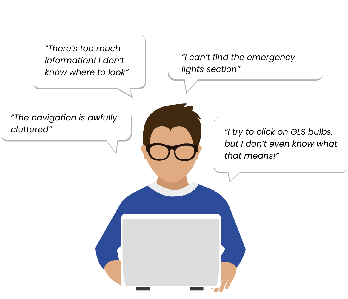
Usability Testing
To validate assumptions about the overall website experience, I conducted usability testing across key customer journeys. Participants were asked to complete common e-commerce tasks, including finding products, browsing categories, using search, reviewing product information, and adding items to the basket.
Findings
- Users struggled to find products without relying on search.
- Technical language and unclear categories made browsing
difficult. - The website felt visually overwhelming, with too much
information presented at once. - Product pages did not always support confident decision-
making.
User Journey Map
To visualize user pain points, I also created a journey map, which helped me understand where users struggled the most and how navigation issues affected their experience.
Competitive Benchmarking
To improve our site’s navigation, I analysed the top competitors in the industry to understand how they structured their menus and organised product information.

Takeaway: Each competitor attempted to solve navigation challenges , but none fully addressed the problem of technical product names while keeping the menu visually intuitive and easy to scan.
Stakeholders Presentation
To align the redesign with business goals, I presented the UX findings and proposed solutions to stakeholders before implementation.
Key discussion points:
- Usability testing insights and customer pain points
- Navigation restructuring and simplified user flows
- Competitor analysis and industry benchmarking
- Reducing cognitive overload through clearer hierarchy
I also showcased some of the redesigned sections to give a before-and-after comparison.The response was great! My ideas were approved, and I got the green light to move forward with implementation.
From Research to Design Direction
After analysing the usability testing and journey map, I translated the findings into clear design priorities for the redesign.
- Simplify product discovery
Reduce the effort needed to find the right product. - Improve visual hierarchy
Make key information easier to scan and prioritise. - Support non-expert users
Reduce reliance on technical product knowledge. - Create a scalable design system
Improve consistency across branding, navigation, product cards, and key pages.
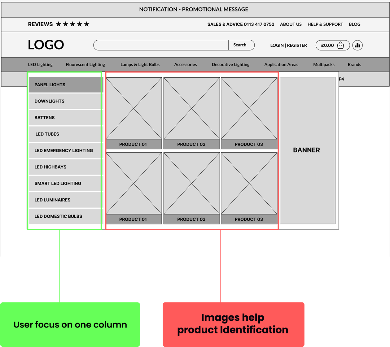
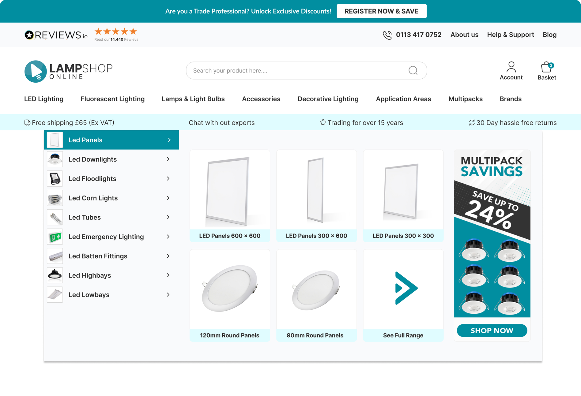
Product Discovery & Navigation
The old navigation showed too many options at once, making product discovery slow and difficult for non-expert users.
- Users had to scan large areas of the screen to find products
- Navigation lacked clear visual hierarchy
- Technical product names made browsing difficult for non-experts
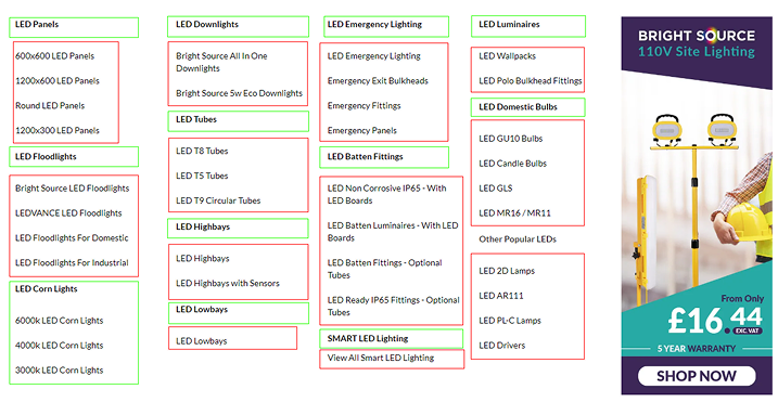
Relevance Mapping
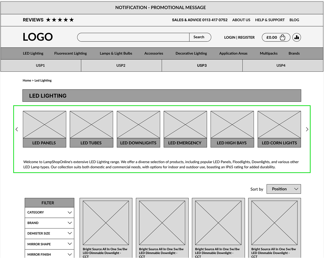
To understand what should stay visible, I separated the menu content into two groups: information users needed immediately, and information that could appear later.
For example, users looking for LED Corn Lights first needed a clear route to the main Corn Lights category.
Detailed subcategories did not need to be visible until they interacted with that category.
This helped shape the new menu structure around progressive disclosure, reducing visual noise while keeping deeper product options accessible.
Green - essential information to find the product
Red - not relevant information at this stage
Wireframes & Exploration:
To improve the user experience, I redesigned the menu with progressive disclosure - a method that gradually reveals details as the user interacts, reducing cognitive overload.To understand what should stay visible, I separated the menu content into two groups: information users needed immediately, and information that could appear later.
Left-Aligned Category List for Better Flow
- Users now focus on one section at a time, instead of scanning the entire screen.
- The list is positioned on the left as this follows the natural reading flow.
- Information is structured top to bottom, making it easier to scan and process.
- In this section the number of visible items has been reduced from 50+ to just 12, making navigation much cleaner.
Adding Images
- As soon as the user hovers over a category, subcategories appear with product images.
- Small product images next to category names and subcategories displayed as pictures.
Strategic Product List Order
- Categories are arranged top bottom based on best-selling and most-searched products, ensuring users find popular items faster.
Adding Application Areas
To further improve navigation, I introduced the Application Areas section, allowing customers to shop by intended use rather than technical product categories.
- Users can now browse lighting solutions based on their needs, such as Office Lighting, Garden Lighting, or Hospitality instead of searching through complex product names.
- This simplifies decision-making for customers who may not know the technical specifications but understand where the lights will be used.
In-Page Category Navigation
In addition to the main navigation, I introduced in-page category navigation on product listing pages to reduce reliance on filters.
Previous usability testing showed that users struggled to narrow down product types using filters alone. By surfacing key category shortcuts directly within the page, users could move between related product types faster and with less effort.
This created a clearer path for product discovery, especially for users who were unsure of the exact product name.
Old Experience: Filter - Dependent Browsing
New Approach: In-Page Category Navigation
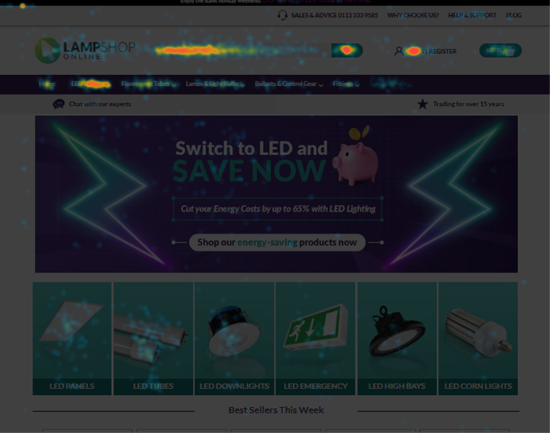
Homepage Redesign
The homepage was redesigned to work as a clearer entry point and reset point in the shopping journey.
If users became lost, they could return to the homepage and quickly find key routes back into the catalogue.
Using heatmap and scroll-map insights, I reorganised the page to prioritise high-value content earlier, including product categories, brand logos, trust signals, and promotional areas.
The goal was to improve credibility, reduce visual clutter, and make product discovery faster from the moment users landed on the site.
Wider Website Improvements
The same UX approach was applied across other key areas of the website to create a more consistent and polished shopping experience.
I reorganised layouts, improved key interactions, and added features to reduce friction across the journey - from browsing categories to selecting products and adding items to the basket.
Key improvements:
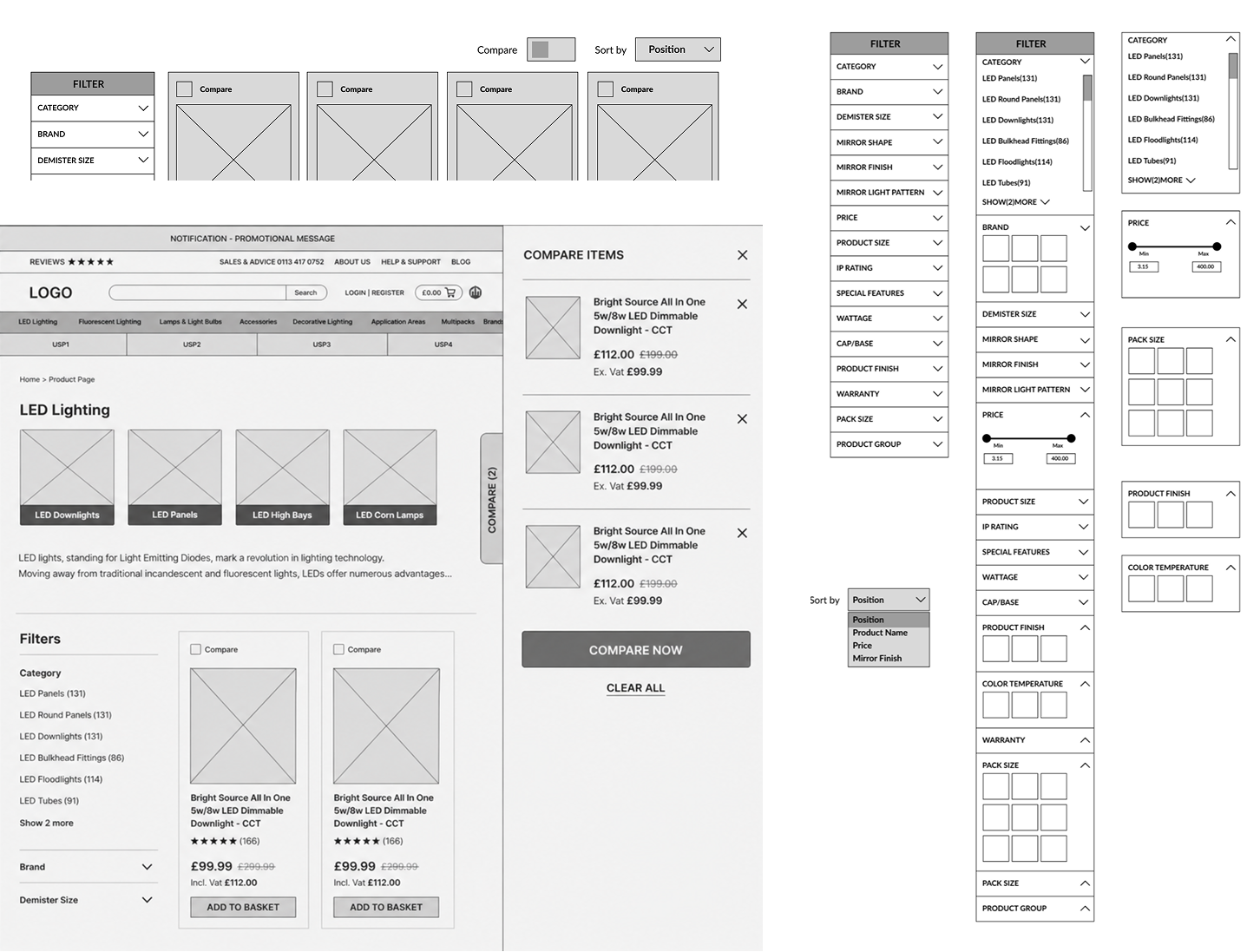
- Compare functionality
Helped users compare similar products more easily. - Reorganised filters
Made product narrowing clearer on category pages. - Restructured product pages
Prioritised price, availability, warranty, reviews, options, and specifications. - Improved basket feedbackAdded a side basket panel after users added an item, replacing a small top-page message that was easy to miss.
- Refined mobile and content pages Created a more consistent experience across smaller screens and supporting pages.
Beyond improving navigation, I redesigned key areas of the website and refreshed the brand identity to create a more modern, consistent, and scalable e-commerce experience.
The goal was to improve trust, visual clarity, and usability across the full shopping journey — from homepage browsing to product selection and checkout actions.
Logo Redesign
I redesigned the logo to create a cleaner, more modern identity that worked better across desktop, mobile, and UI touchpoints.
I removed the tagline because the brand name was already self-explanatory, while the handwritten text became difficult to read at smaller sizes.
I also simplified the icon shape and updated the colour palette to create a more consistent, scalable, and professional brand mark.
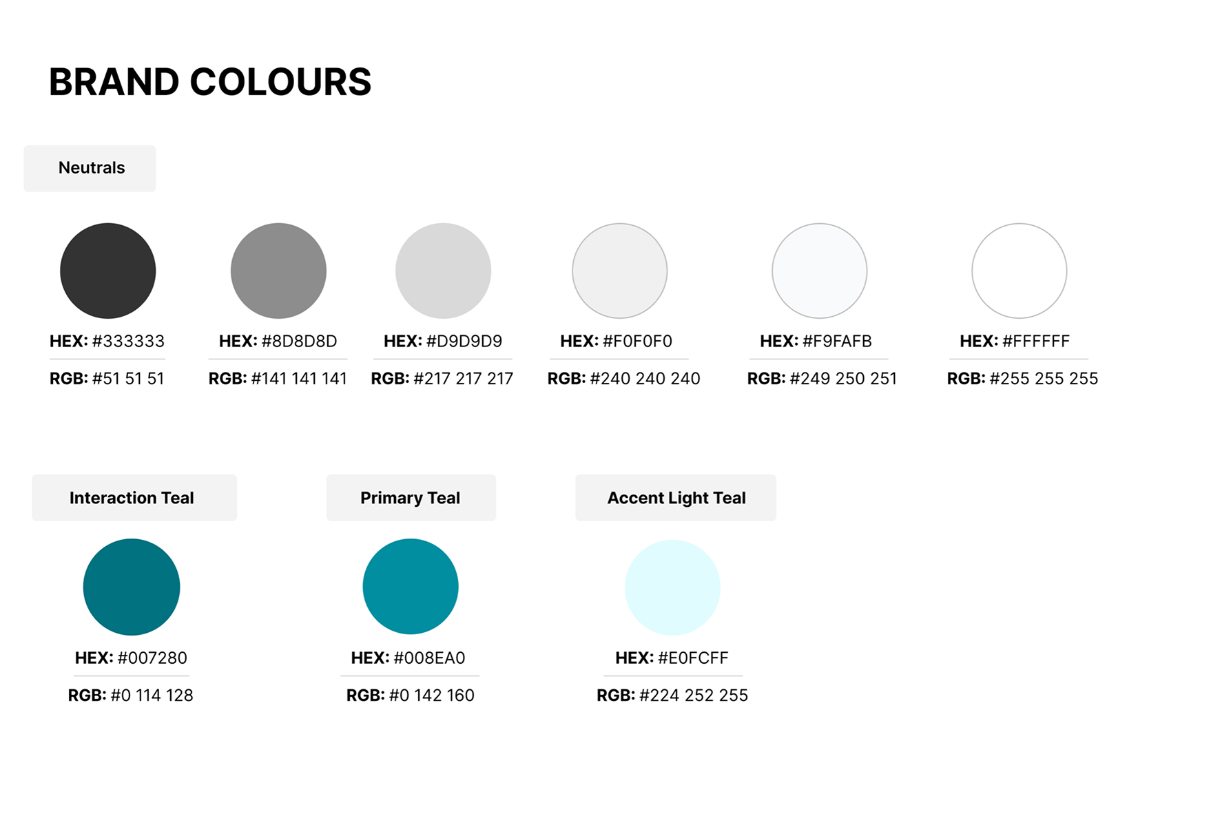
Colour Palette
The colour palette was refreshed to create a cleaner, more consistent visual system across the website. Teal became the primary brand colour, supported by neutral greys and light teal UI accents for backgrounds, hover states, and highlights.
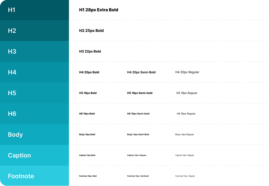
Typography
We replaced Lato with Inter to improve readability and consistency across the e-commerce experience.Inter was selected for its clarity in digital interfaces, especially where users need to scan product names, prices, specifications, filters, and CTAs quickly.The new typography system created clearer hierarchy, making key information easier to read and compare
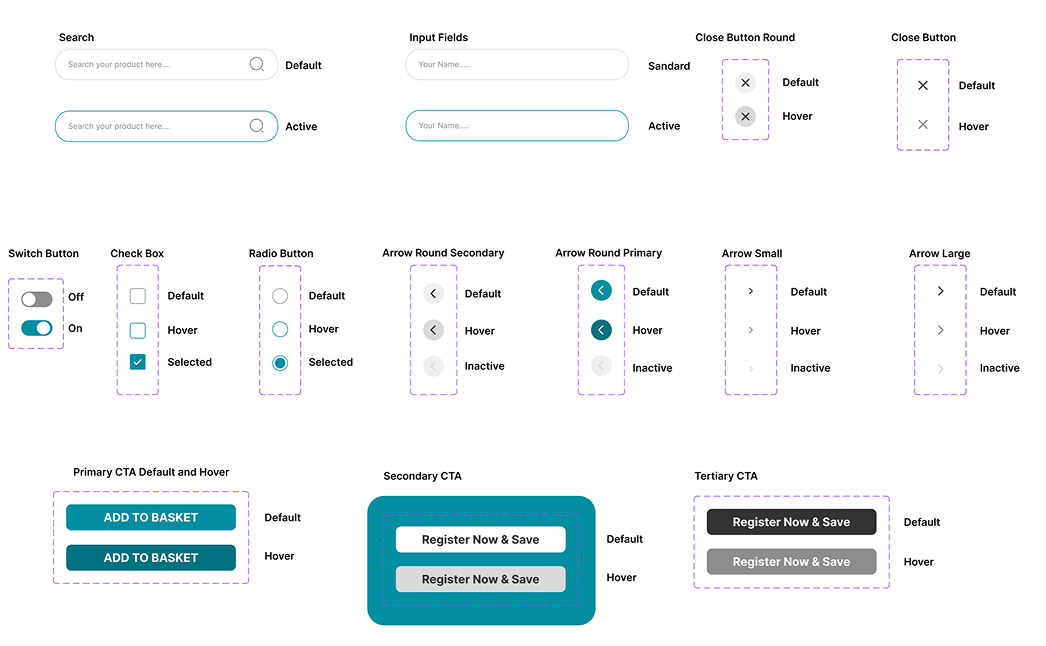
UI Components & Interaction States
To support consistency across the redesign, I created reusable UI components for key interactions such as search, forms, buttons, filters, selection states, and navigation controls.
This helped standardise the experience across product listing pages, product pages, mobile layouts, and promotional areas.
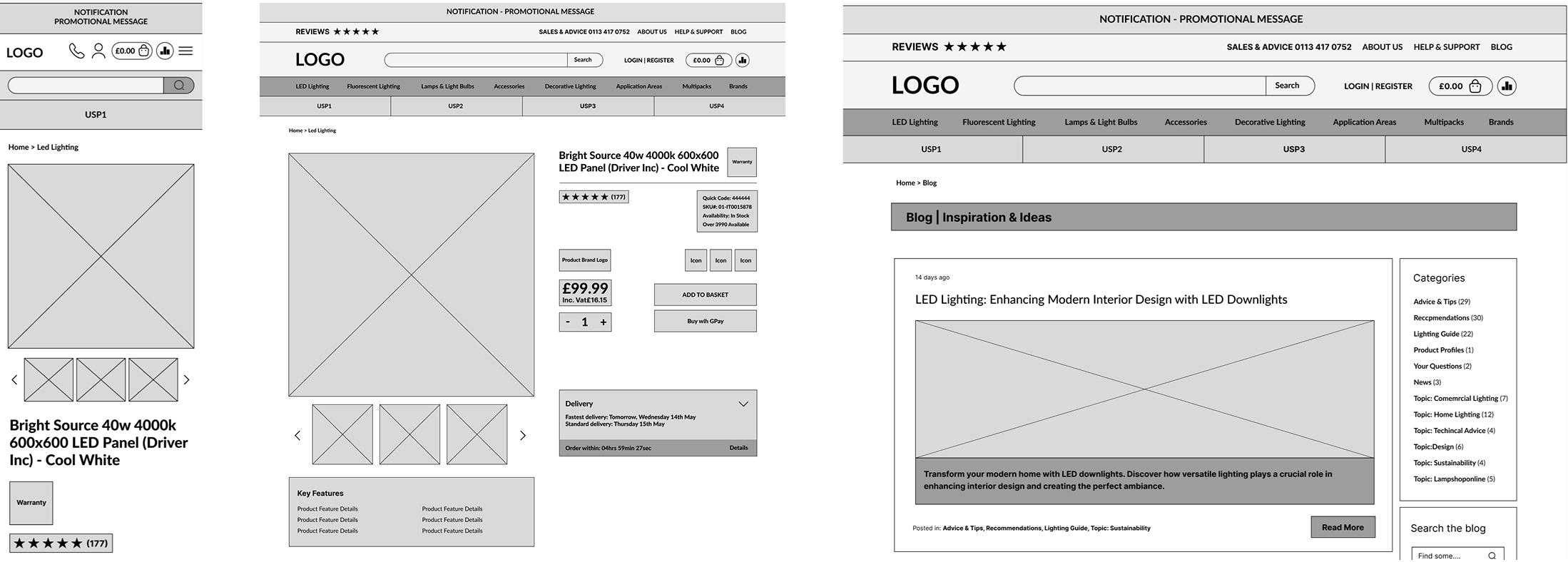
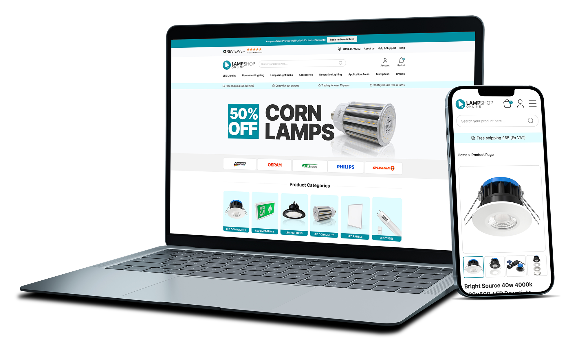
Homepage Design
A cleaner entry point with stronger trust signals, clearer product categories, and refreshed promotional content.
%202.jpg)
Product Listing
Improved category access, cleaner product cards, reorganised filters, and compare functionality.
.png)
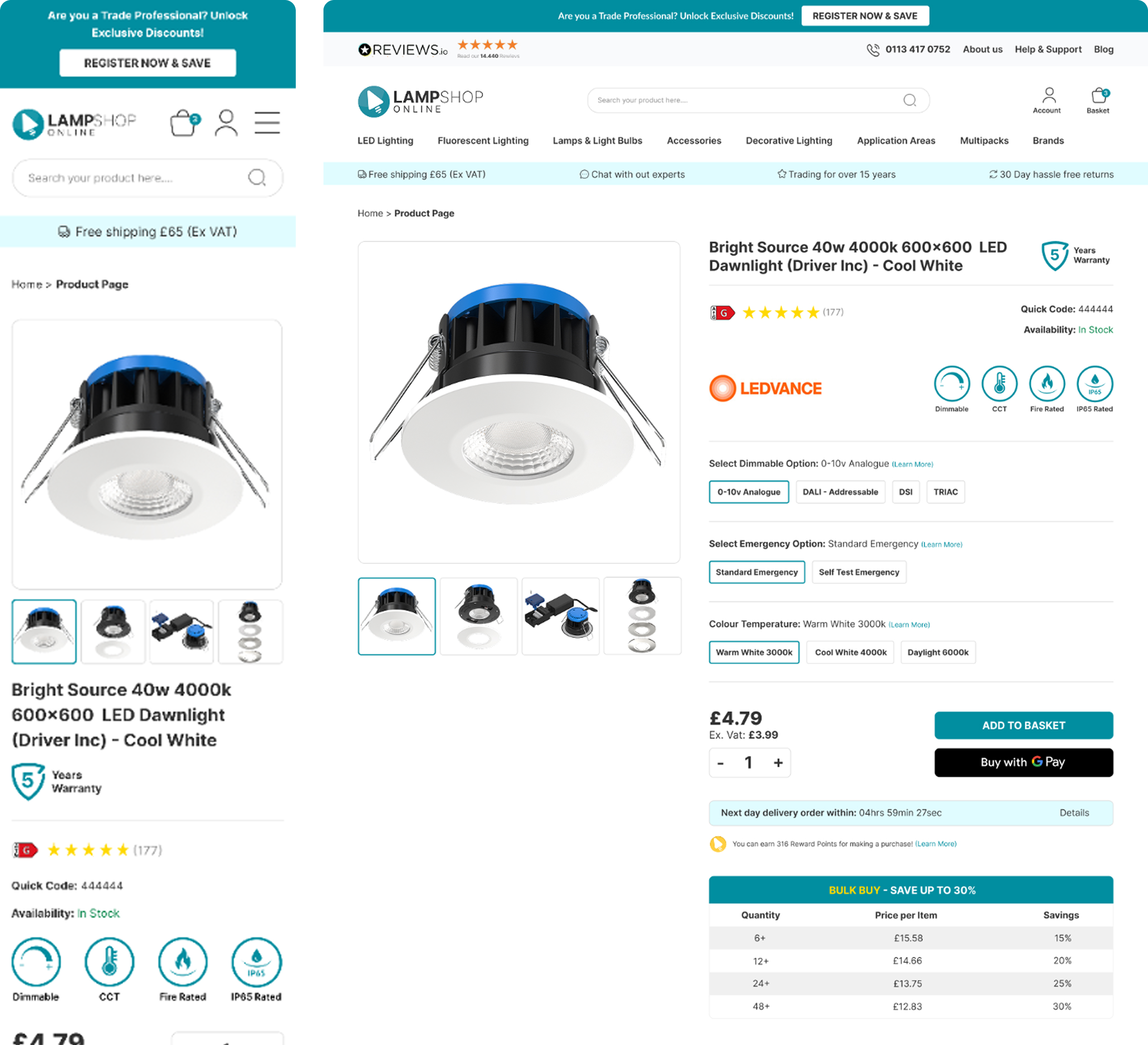
Product page
Clearer product information hierarchy, stronger option selection, and more visible purchase actions.
Top Navigation
Left-aligned categories, progressive disclosure, and visual subcategory previews.
Business Impact
- 11% increase in conversion Rate
- Improved product discoverability and engagement
- Application Areas generate 13% of total revenue.
- Reduced user confusion across key journeys
Next Steps
Further Usability Testing - Further usability testing will be carried out to validate the new navigation, product discovery flow, and key shopping interactions.
Data-Driven Iteration - We have implemented analytics tools to track user interactions.
Final Thoughts
This project was a turning point for me. Introducing research and usability testing into the company pushed me outside my comfort zone, challenging me to take a new approach without knowing for certain if I was heading in the right direction.
What truly surprised me was how powerful usability testing turned out to be. I hadn’t expected to uncover so many issues affecting the user experience. The best part, of course, was seeing the changes implemented and making a real impact on the business.
What I’d Do Differently
While we identified many issues and worked on improving them, not everything could be addressed due to technical constraints and shifting business priorities. In an ideal scenario, we would have been able to act on more of the findings to create an even smoother experience.
Additionally, over time, different teams have made changes to sections of the site, which has made it harder to track the direct impact of the redesign.
While I’ve raised this challenge a few times, I understand that evolving business needs often take priority. Moving forward, I’d love to see a more structured approach to tracking design changes to ensure we continue making data-driven improvements.

%201.jpg)


.png)